Phase: Stop Self Harm
Principle: Understand What is Being Considered
Practice: Understand Evolution
Understand Evolution
Communication
Motivation
There is a strong correlation between awareness and performance, so focus on this. Try to understand the landscape that you are competing in. Understand any proposals in these terms. Look before you leap.
Consider these first
Illustrative description
Components evolve through four stages of evolution. Identify the stage of evolution for each component of the value chain.
- Genesis: Unique, very rare, uncertain, changing all the time, recently discovered.
- Custom built: Very uncommon and which we are still learning about. Made as one off and tailored for a specific environment. It is bespoke. It changes often. It is an artisan skill.
- Product (including rental): Becoming common. Manufactured through a repeatable process, more defined, better understood.
- Commodity (including utility): Scaled and volume operations of production (repetition, repetition, repetition). Standardized, defined, and fixed. Undifferentiated, and fit for a specific known purpose.
Detailed description
Components evolve through four stages of evolution due to supply and demand competition. The stages of evolution correspond to ubiquity and certainty. Ubiquity approximates diffusion of component in a market. Certainty approximates how complete, well-understood, and fit for purpose the component is.
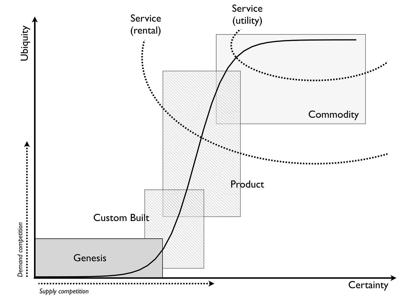
Genesis is uncertain with no or very little ubiquity. Commodity is very certain with maximal ubiquity.
We can determine ubiquity only in retrospect once a component reaches commodity stage. Thus, we use certainty as the primary measurement for estimating evolutionary stage.
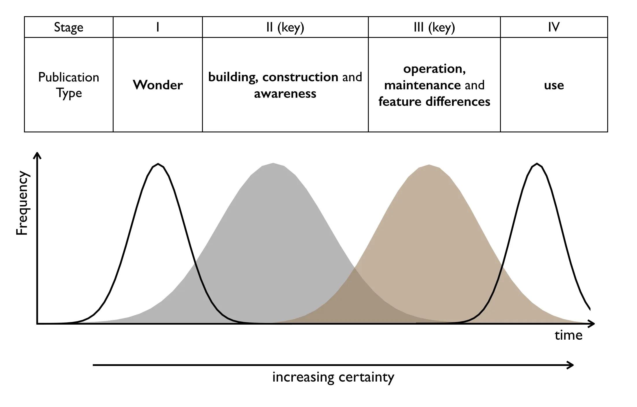
To identify component certainty consider the language publications use to describe it. Publications start with wonder of the thing and over time end up talking only about its use.
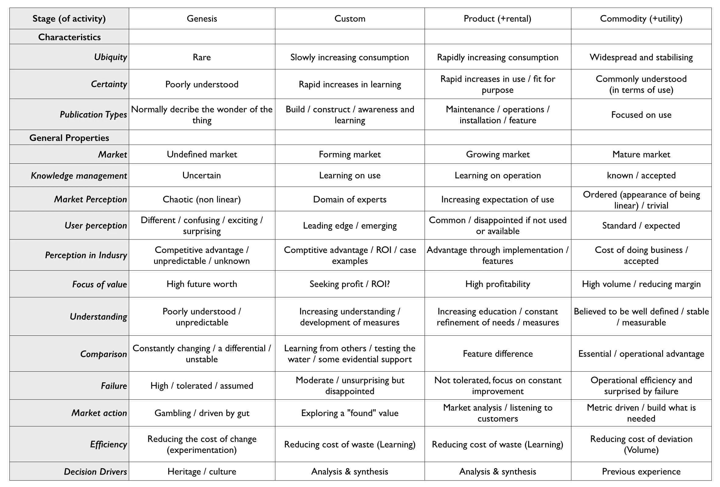
Many characteristics and properties help with approximating the stage of evolution:
Do not confuse evolution with diffusion. Both patterns have an S-curve shape.
Diffusion is adoption of a specific change over time. The change can be novel or a feature or a specific business model. The first telephone diffused. A better method of producing glass known (Pilkington float glass method) diffused. New and improved washing powder diffuses. Utility model for provision of electricity diffused.
Evolution deals with the changing nature of something. It is not about a specific change. Instead, it shows how an activity evolved from custom built to more of a product. Evolution of an act is thousands of diffusion curves of improving versions of that act. Each version having their own chasms. Each more evolved version will diffuse from early adopters to laggards. It will diffuse through its own applicable market. That market can and does grow as the act becomes more accessible to a larger audience.
Many diffusion curves from many improving versions (A[1-5]):
![The image features a set of S-shaped curves plotted on a graph that represents the market adoption over time of various items, labeled from A[1] to A[5]. Each curve reaches a point labeled '100% adoption A[n]', indicating the moment when each item has been fully embraced by the applicable market. The x-axis is labeled 'Time' and the y-axis 'Applicable Market'. The lengths of the horizontal lines at the top, labeled 'Time for A[2]' and 'Time for A[5]', denote the time it takes for A[2] and A[5] to reach full market adoption, respectively. The vertical line on the left, labeled 'Market difference from A[4] to A[5]', suggests a comparison in market size or potential between items A[4] and A[5]. Each curve is steeper than the preceding one, implying a quicker adoption rate for subsequent items.](https://www.mapkeepimages.com/cdn-cgi/image/width=3840,quality=75,format=auto/https://help.mapkeep.com/images/many-diffusion-curves-20240406.jpeg)
Each version of the act diffuses to 100% adoption of its market. Those applicable markets could be different sizes for different versions. The market for the first phones might not be the same market for later, more evolved phones. The time for diffusion of each version could also be different.
For each of the components in your value chain, determine the stage of evolution. Use the various characteristics and properties above.
Reminder: Stop reading, take action