Phase: Stop Self Harm
Principle: Understand What is Being Considered
Practice: Map the Landscape
Map the Landscape
Communication
Motivation
There is a strong correlation between awareness and performance, so focus on this. Try to understand the landscape that you are competing in. Understand any proposals in these terms. Look before you leap.
Consider these first
- Understand Evolution
- Understand Types of Components
- Know Your Users
- Focus on User Needs
- Know the Details
Illustrative description
Make a map. Map is visual and context specific. The map has an anchor which is the user and their needs. The position of components in the map is relative to that user on a value chain, represented by the vertical axis. The components of the map also have a stage of evolution, represented by the horizontal axis.
Detailed description
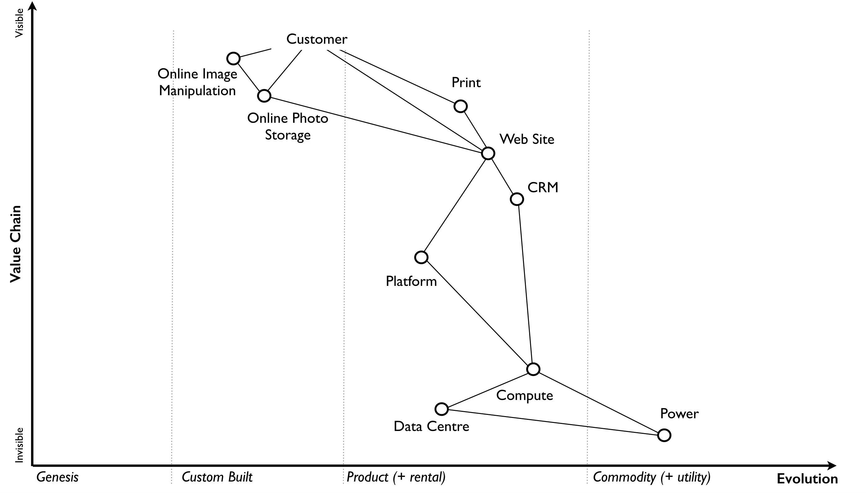
An example of a completed map
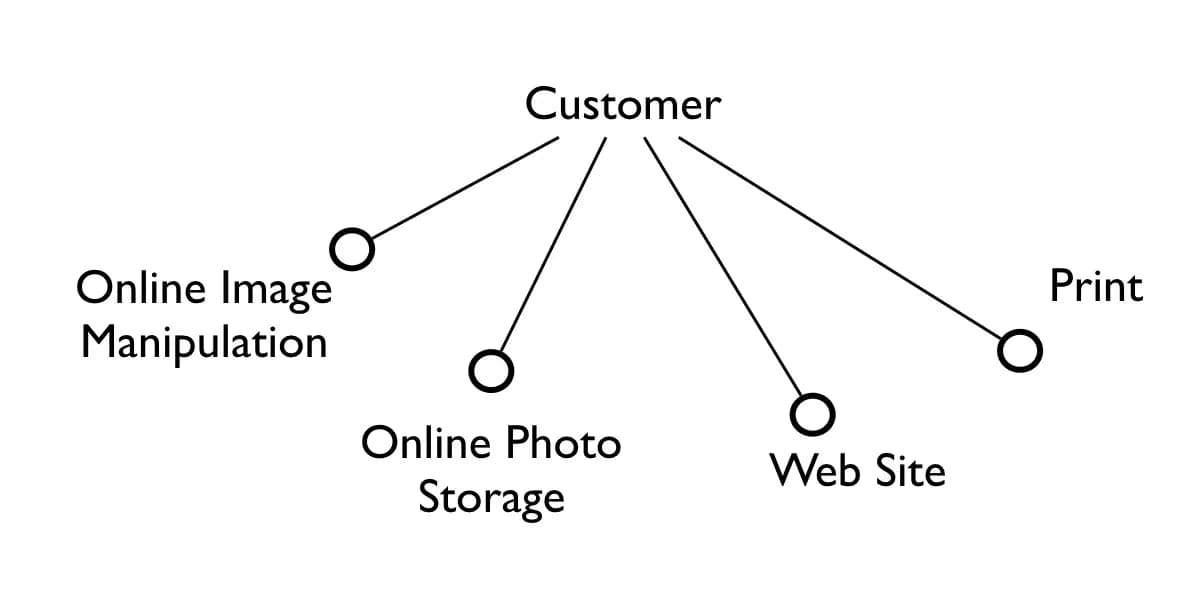
To create a map step-by-step, start with users and their needs. Recall users and needs identified in Know Your Users and Focus on User Needs:
Know the Details identified the value chain anchored with the user and their needs. For next step, extend the diagram of user and their needs to include the value chain.
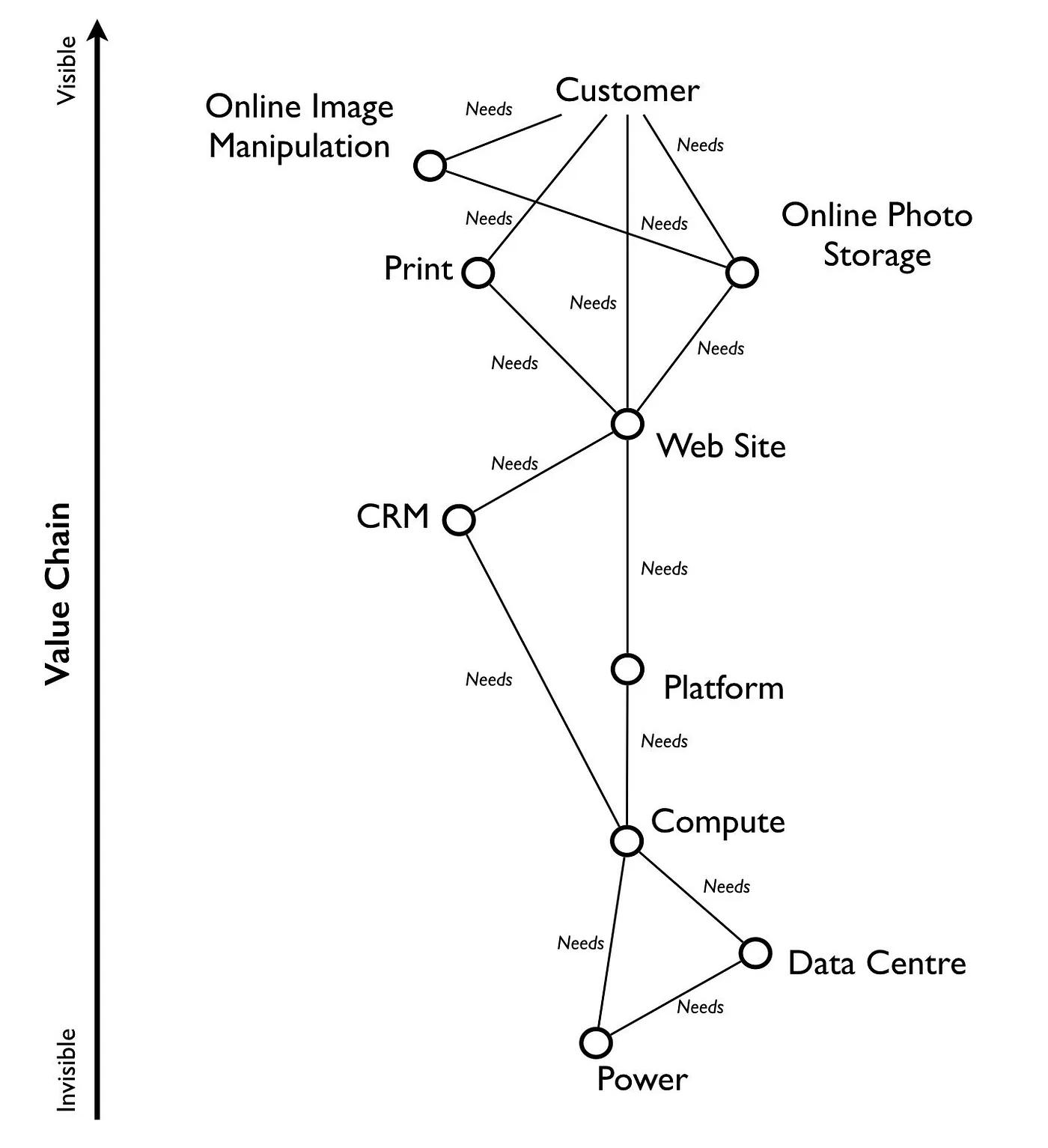
Take the value chain and turn it into a map with an evolution axis.
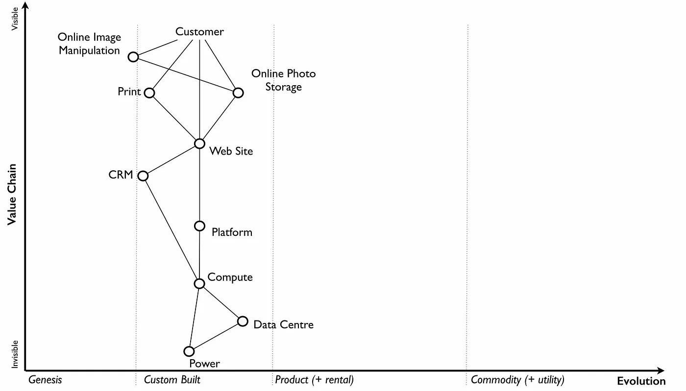
Place the components into their stages of evolution. Be warned, this step is often the main cause of arguments. You will come across components that people feel passionate about. They will declare it as unique despite the fact that all the competitors have it. There is also the danger that you might describe a component by how you treat it. Consider how everyone treats it, not only you.
A single component can actually consist of many subcomponents. This may cause disagreement about the stage of evolution. Break down such component into subcomponents. It may be the case that most subcomponents are commodity while few are novel.
The evolution characteristics and properties cheat sheet may be helpful here.
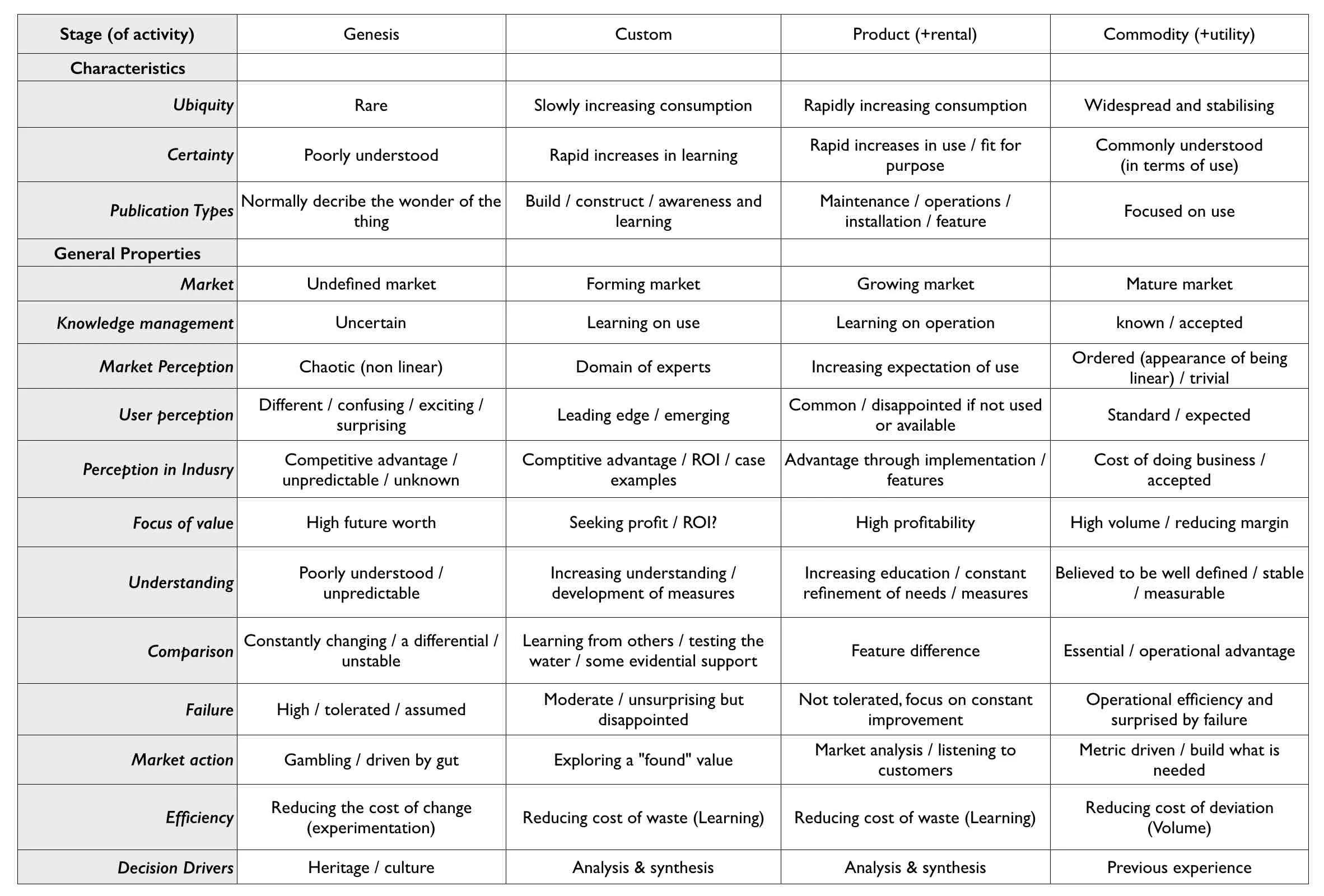
Don’t worry if some of the terms are confusing in the cheat sheet, use what you can. Aim to complete an entire map of a line of business in a matter of hours. There is nothing wrong with spending longer in your first attempts. It takes time to get used to the process.
After this, you should have a map.
This map is now an artifact encoding your specific context. The map resulted from application of doctrine up to this point. It is an essential artifact for communication. The rest of doctrine application will often rely on maps for communication.
Basic components of a map.
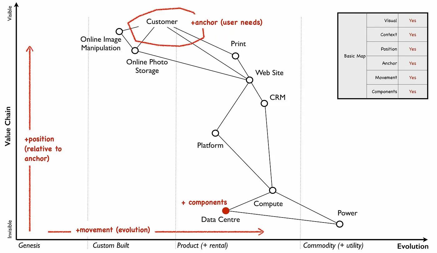
This map has all the basic elements of any map — visual, context specific, position of components (based upon an anchor) and movement.
You can annotate maps in many ways. Know the Details identified some candidate annotations: differentials, barriers to entry, and constraints. It may be helpful to annotate the map with these. There will be more annotations introduced as part of future doctrine.
Reminder: Stop reading, take action